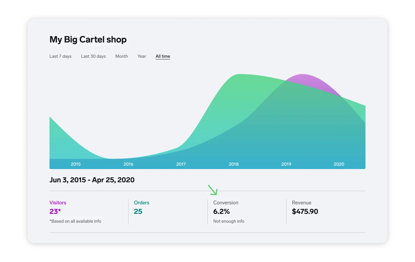
The conversion rate shows you the percentage of people visiting your shop who place orders. Ideally you want this number to be as high as possible as it means more visitors are choosing to buy your products.
Got a low conversion rate? Time to strategize ways to turn browsers into paying customers. How about sharing a discount code on social media, updating your product images or store theme, or marking down prices on certain items and labeling them 'on sale'?
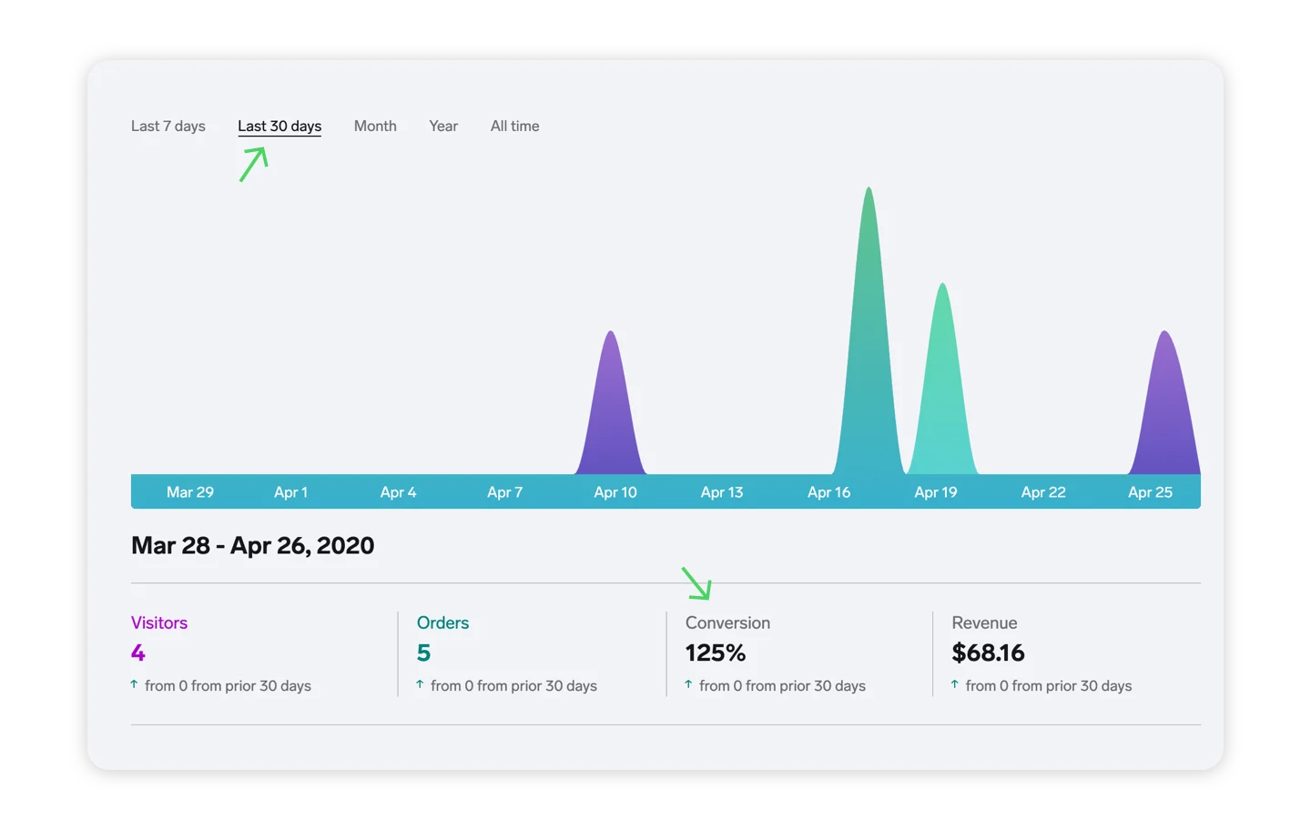
Trends help you compare precise changes for each stat over the previous period. The green up arrow and red down arrow will make it easy to see at a glance, so you'll know exactly what's working and what's not.
Got a solid bump in sales after you boosted a social media post? Try that on another post and see if you strike gold. Seeing a dip in traffic during a slow season? Maybe it's time to spice things up with a little sale.
Checking in regularly to keep a pulse on your Dashboard stats and use what you learn to improve your shop. Mastering your stats can really pay off! 📈
Missing some stats? Prior to February 2017 visitor stats weren’t tracked for accounts on our free Gold plan, and they were only retained in the dashboard for accounts on a paid plan after mid-2015.
These missing stats make it so we can’t always calculate a conversion rate, so you’ll see a dash instead of a percentage if the rate can’t be determined. The good news is all accounts, both free and paid, now have access to the same dashboard stats.